Author: automation bot

  • FlowMail 26.2 — now on iPhone and iPad, and it checks who really sent a message

    FlowMail 26.2 — now on iPhone and iPad, and it checks who really sent a message

    FlowMail 26.2 is on the App Store, and for the first time it is on iPhone and iPad as well as the Mac. It is the same app on all three, so one purchase covers every device you use it on. The release also adds two things you can do to any message: ask it whether it is what it claims to be, and read it in your own language.

    Verify: ask a message who really sent it

    Open a message and tap Verify in the toolbar. FlowMail reads what the message already contains and tells you, in plain words, what it found. It runs only when you tap it — never during sync, never in the background.

    These are the patterns it looks for, each one a check with its own finding:

    • Links that lie. A link that reads as one address and goes to another, one that imitates the sender’s domain by a single character, one that uses letters from another alphabet to look like a familiar name, a shortened link whose destination the message does not show, and a link that redirects somewhere else.
    • Senders that do not add up. A sender’s name that reads as one domain while the address is another — the classic "billing@supplier.com" <someone@gmail.com> — replies that would go to a different domain, and a message handed over by a different domain from the one it claims.
    • Conversations that changed hands. A reply to a message you never received, and a thread whose sender’s domain changed partway through, which is the shape of an invoice-fraud hijack.
    • Attachments that are not what they say. A file that runs a program when opened, one whose name hides its real type, one described as a different kind of file, and document types that can carry macros.
    • SPF, DKIM and DMARC, as the server that delivered the message reported them.

    That last line is the one people over-trust. SPF, DKIM and DMARC are the checks mail servers run to confirm which domain a message came from. A pass proves the domain, not the person: a Gmail account asking you to send your supplier’s next payment somewhere new can pass all three. Business email compromise, the FBI’s name for scams like this, cost $3bn in reported losses in 2025.

    Nothing the message points at is fetched to do this. No link is opened and no attachment is downloaded: the checks work from the addresses, headers and text already on your device, so a hostile message gets nothing back from being checked.

    It never says “safe”

    The answer comes as one of three headlines: Nothing unusual in these checks, Worth knowing before you act, or Signs this may not be from who it claims. None of them says a message is safe, because no set of checks can know that. The strongest thing Verify will say is that nothing it looked at stood out, which is a statement about the checks rather than the message. It is not antivirus and it does not scan for viruses, and the sheet says so.

    Under the headline, Verify lists what it checked and what it could not. A result reached with no research server and no model is a narrower answer than one reached with both, and the sheet tells you which one you are looking at.

    Two optional extras, both off until you choose them

    Your own research server. If you run an MCP server that knows about domain age and reputation, FlowMail can ask it about the message. Before the first lookup, the sheet shows exactly what would be sent and offers Check on This Device Only instead. What goes is the list of domains involved — the sender’s, the reply address, and every domain the message links to — and a SHA-256 fingerprint of any attachment already on your device. The subject, the text of the message, your own address and attachment filenames are not sent, and no attachment is uploaded. FlowMail brings no server of its own to this: the lookup goes to the server you chose, or nowhere.

    An on-device model to explain the findings. If you have downloaded a model in Settings, it adds a few sentences under the findings putting them in words. It gets no vote. Its lines are left out before the headline is worked out, so the verdict comes from the checks alone — which means a message written to talk a model round cannot talk itself into a clean result.

    Translate a message where it is

    Translate in the same toolbar turns a message into your language using Apple’s on-device translation. It keeps the message’s formatting and its quoted history, and you can switch between the original, the translation and the two side by side. A translation is kept with the message, so opening it again shows what you already translated rather than asking for it a second time. Settings sets the language it translates into.

    Very long messages have a limit. When one runs past it, FlowMail translates what it can and tells you that the rest is still in the original language, rather than quietly stopping halfway.

    Also in 26.2

    • A transform step for workflows. Pull a piece out of a message, filter it or reformat text, and hand the result to the next step, without writing a prompt for it.
    • Select several messages and archive, flag or delete them in one go.
    • Filter the list to what you have replied to, or what you have not.
    • Signatures sit above the quoted history in a reply, with their formatting intact, and are set per account.
    • A message you answered on another device now shows as answered here too.
    • Attachments are handled more reliably, including several with the same name in one message.
    • Account settings say more clearly what state each account and its credentials are in.

    What is free

    Verify and Translate are both in the free app, on every device. The list, the Kanban board and your first workflow are free as before. FlowMail Pro adds the conversation graph, the thread tree, unlimited workflows and the Classify step, as a monthly or annual subscription or a one-time lifetime unlock — current prices are on the App Store listing, and one purchase covers iPhone, iPad and Mac.

    What you need

    • iOS or iPadOS 18.6 or later on iPhone and iPad, macOS 15.6 or later on a Mac.
    • Nothing else for Verify. The checks on your device need no account, no server and no download. The research server and the model are extras you add if you want them.

    More

    • FlowMail — the product page, with the App Store links for Mac and for iPhone and iPad
    • FlowMail privacy policy — where your mail lives and what leaves the device
    • FlowMail FAQ — accounts, syncing and the local model
    • FlowMail 26.1 — the board, the graph and the workflows this release builds on
  • Nutri-Score, NOVA and additives, in plain English

    Nutri-Score, NOVA and additives, in plain English

    Some foods in slotho carry two small badges: a letter from A to E, and a number from 1 to 4. Plenty of foods carry neither, which is the first thing worth explaining. They look like two versions of the same verdict. They are not. One is about what is in the food; the other is about what was done to it — and a food can score well on one and badly on the other without either being wrong.

    They come from Open Food Facts, and slotho searches three other food databases besides it — so whether you see them at all depends on which one your result came from. Here is what each badge measures, why a row often has none, and the one score you can sort by but never see.

    Nutri-Score: the letter, A to E

    Nutri-Score grades a food’s nutritional composition per 100 g or 100 ml. Points are counted against it for energy, sugars, saturated fat and salt, and counted back in its favour for fibre, protein and fruit, vegetables and legumes. The balance lands on a letter: A is the better end, E the worse.

    The algorithm was revised by a European scientific committee and the new version took effect on 1 January 2024, with a transition period that ran to the end of 2025 — so the grades you see now are the updated ones. The revision was stricter about sugar, salt and sweeteners, kinder to protein and fibre, and moved nuts and seeds out of the fruit-and-vegetables component. One consequence is easy to state and slightly startling: among drinks, only water can still score an A.

    What the letter does not tell you is whether the food suits you. It is computed per 100 g against a general population, not against your day, your targets or your medical situation. A food that is an E in the abstract can be entirely reasonable in the quantity you actually ate.

    NOVA: the number, 1 to 4

    NOVA ignores nutrition entirely. It classifies a food by how much industrial processing it has been through, in four groups:

    • 1 — unprocessed or minimally processed. An apple. Plain rice. Milk.
    • 2 — processed culinary ingredients. Oil, butter, sugar, salt: things you cook with rather than eat alone.
    • 3 — processed foods. Group 1 plus group 2, and not much else. Tinned beans, bread, cheese.
    • 4 — ultra-processed. Formulations built largely from substances not used in home cooking: protein isolates, modified starches, emulsifiers, colourings, sweeteners.

    A NOVA 4 is not automatically nutritionally bad, and a NOVA 1 is not automatically good — butter is group 2 and no one would call it a health food on that basis.

    Why they disagree, and why that is the useful part

    This is the whole reason slotho shows both rather than picking one.

    A diet drink can be reformulated into a good Nutri-Score while remaining unambiguously ultra-processed. A wholemeal loaf with a long ingredient list can be NOVA 4 and still be a sensible thing to eat. The two systems are measuring two distinct dimensions of the same food, which is exactly what a 2024 study of the revised algorithm concluded — the update made them more coherent with one another without making either redundant.

    If the two badges ever make you look at an ingredient list you would otherwise have skipped, they have done their job. Collapsing them into a single number would remove precisely the information that makes them worth showing.

    The third badge: additives

    Alongside the letter and the number, a food may carry a small count of additives. Tap through to the product detail and slotho lists them individually as E-numbers — the raw data arrives as tags like en:e330 and is displayed as E330.

    It is a count, not a verdict. E330 is citric acid. The chip tells you how many there are and lets you go and look; it does not tell you that any of them is a problem, because that is not a judgement a food log is in a position to make.

    Eco-Score: you can sort by it, you will not see it

    Worth being straight about, because Eco-Score comes up alongside the other two often enough that its absence looks like an oversight.

    Eco-Score rates environmental impact rather than nutrition or processing. In slotho it exists only as a way to sort search results. It is not stored on a food, it is not shown as a badge, and it is not saved against anything you log — unlike Nutri-Score, NOVA and the additive count, which are all written onto the entry so your history keeps them.

    That is a deliberate gap rather than a hidden feature: showing a badge implies we stand behind the number, and this one is not carried consistently enough across the database to stand behind yet.

    Where the numbers come from — and why a food often has none

    slotho does not compute any of these itself. They come with the food record, from Open Food Facts — a public, crowdsourced database. Which explains the thing people notice first: plenty of foods have no badges at all.

    slotho searches four sources — Open Food Facts, the USDA’s FoodData Central, FatSecret, and foods you created yourself — and only Open Food Facts carries these three scores. A barcode scanned off a European packet usually has all of them. A generic ingredient that came back from one of the other three has none, because the scores were never part of that record to begin with.

    There is a way to tell at a glance. Every row carries a small coloured source chip: OFF, FDC, FatSecret or Local. If it does not say OFF, that row will never show a Nutri-Score or a NOVA number, however well known the food is. When slotho has two records for the same food from different sources, it fills the gaps from whichever one has the data — a record with no grade can inherit one from its twin rather than showing a blank.

    And a missing badge means unknown, never bad. slotho hides the placeholder rather than showing an empty grade, for the same reason the daily balance score treats an unlogged meal as a gap instead of a zero — a blank is information about the database, not about your food.

    What slotho deliberately does not do with them

    None of these scores feeds your daily balance. None of them produces a warning, a nudge or a streak you can break. There is no screen that adds up your week’s NOVA 4s and has an opinion about it.

    They are labels on a food, shown at the moment you are choosing it, and then recorded so your history is honest about what you logged. What you do with them is the part we have no business automating.

    More

    Nutri-Score, NOVA and Eco-Score are third-party systems, not ours, and none of this is medical or dietary advice. slotho is free on the App Store for iPhone, iPad and Apple Watch, with two weeks of Pro included.

  • FlowMail 26.1 — your Mac inbox as a Kanban board

    FlowMail 26.1 — your Mac inbox as a Kanban board

    FlowMail 26.1 is on the Mac App Store. It is a Kanban email client for Mac: one inbox drawn three ways — as a list, as a board, and as a graph of who replied to what — with its AI running on your own machine rather than on somebody else’s server. Free to download, macOS 15.6 or later.

    Three views, one inbox

    The premise is that an inbox is not one shape. Sometimes you want the list, because you are reading. Sometimes you want to see what you have actually committed to, which is a board. And occasionally a thread has grown twenty messages and four participants, and what you want is to see its shape.

    So the same mail is drawn three ways, and the toolbar switches between them. Nothing is moved or copied to do it — it is one set of messages under three renderings.

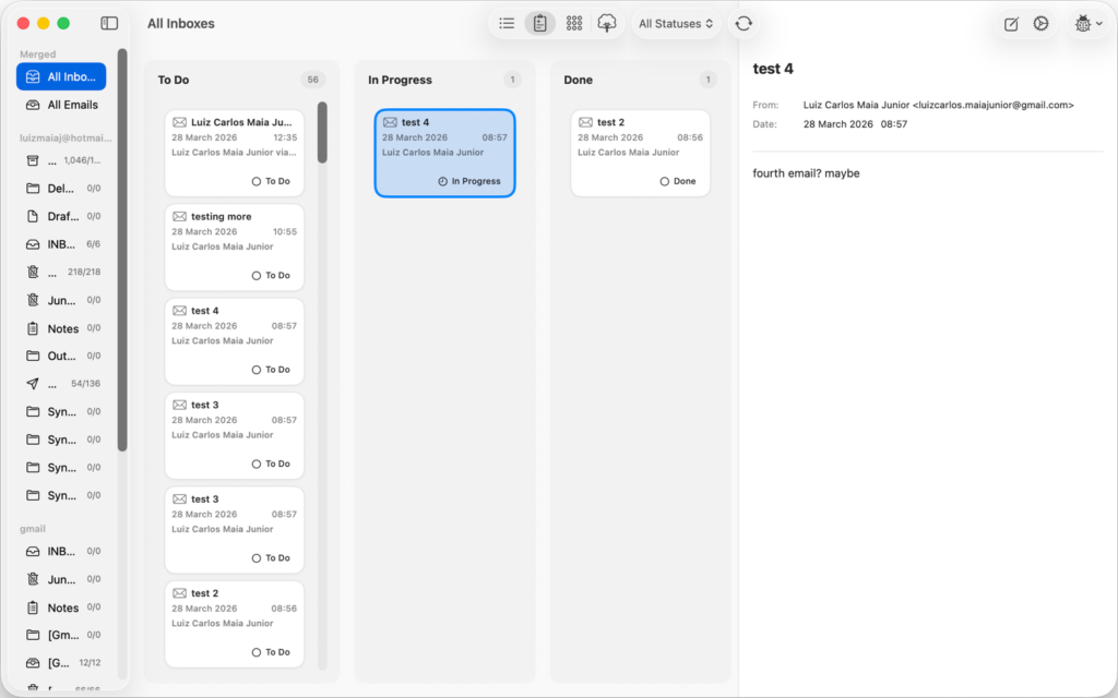
    FlowMail, a Kanban email client for Mac, showing an inbox as a board with To Do, In Progress and Done columns, an email card selected and its contents in the reading pane
    The board view. Dragging a message between columns is the whole interaction.

    The board has three columns, and that is on purpose for now

    To Do, In Progress, Done. A message lands in To Do and you drag it rightwards as you deal with it, which is the same gesture you already make in every project tool you use.

    Being straight about the limit: in 26.1 those three columns are what you get. Settings lets you recolour them, and that is all it lets you do. Renaming and adding columns are not in this release — the board’s job right now is to be the fastest possible triage, and three columns is the version of that which needs no setting up.

    The graph is for the threads that got out of hand

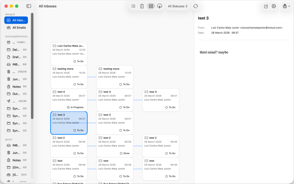
    Every message is a node, every reply is a line back to the message it answers. A long thread stops being a wall of quoted text and becomes something you can look at: who is actually talking to whom, where the conversation forked, which branch died.

    FlowMail on macOS showing a conversation graph, with email messages drawn as connected nodes and lines linking replies to the messages they answer
    The conversation graph. Each node is a message; the lines are replies.

    What changed in 26.1

    • The automation engine was rebuilt. Workflow steps and the system integrations around them were overhauled, which is the unglamorous half of this release and the half everything else depends on.
    • Workflows gained data actions and better context handling. A step can now read and change FlowMail’s own mail — query the inbox, move a card, apply or remove a label — and pass what it found to the next step as a variable.
    • Layout stability in the graph views. Plus general interface and performance work across the app.
    • vCard and iCalendar files. FlowMail now reads and writes standard .vcf and .ics attachments rather than treating them as opaque blobs.

    The AI runs on your Mac, on a model you chose

    There is no API key to paste, no account to create, and no request leaving your machine to make any of it work. FlowMail uses Apple’s MLX to run a language model locally, and the model is one you pick and download yourself in Settings:

    • Qwen3 4B Instruct — about 2.4 GB, and the default
    • Llama 3.2 3B Instruct — about 1.8 GB
    • Qwen3 1.7B — about 1.0 GB
    • Llama 3.2 1B Instruct — about 0.7 GB

    Two honest caveats. On-device inference is Apple Silicon only — on an Intel Mac the rest of FlowMail works and the AI steps do not. And nothing happens until you download a model, because none is bundled: a 2.4 GB download inside a 10 MB app would be a strange thing to force on someone who only wanted a mail client. There is a single switch in Settings to turn the whole thing off.

    The list is deliberately short, too. It holds the models whose architectures the shipped MLX runtime actually supports, so nothing in the picker fails to load after you have waited for the download.

    It writes drafts. It does not send them

    A workflow can compose a reply for you. What it then does is save that reply into Drafts, addressed to the original sender and threaded to the message it answers, and stop. One limit worth knowing in 26.1: that draft is written to Drafts on this Mac. Pushing it up to your mail server, so it also appears in Drafts on your phone, is a follow-up rather than something this version does.

    There is no configuration that makes it send. An automation that mails people on your behalf while you are not watching is a bad idea however good the model is, and the failure mode is one you cannot take back — so the send button stays where it has always been, under your finger.

    What a workflow can actually do

    A workflow is an ordered list of steps. Each step is either a prompt to the local model or one of these built-in functions, and each can hand its output to the next as a named variable:

    • Query emails — search your inbox by subject, sender or body
    • Summarize and Classify — run text through the on-device model
    • Draft reply — write to Drafts, as above
    • Set Kanban status, apply label, remove label — move the mail around
    • Web search and URL content — pull something in from outside
    • Call MCP tool — see below

    A workflow step can call an MCP tool

    This is the part we are least able to be modest about. FlowMail speaks the Model Context Protocol: you add your own MCP servers in Settings, their credentials go in the Keychain, and a workflow step can then call any tool those servers expose, with arguments built from the email it is running on.

    Which means the rule “when an invoice arrives, file it in the system that tracks invoices” is a three-step workflow rather than a feature request. Your mail client can reach the tools you already run.

    Siri, Spotlight and Shortcuts, without setting anything up

    Installing FlowMail publishes its actions to Shortcuts, Spotlight and Siri automatically. “Run my FlowMail workflow” works out of the box, as do composing an email, moving a message between columns, archiving, and marking read or unread. Behind those are the finer-grained intents — find emails, read an email’s details, apply or remove a label — for building your own shortcuts.

    Where your mail actually lives

    On your Mac, in a local SwiftData store. FlowMail has no server of its own — there is no red8.io account, and nothing about your mail is relayed through us, because there is no “through us” for it to pass.

    Accounts connect the ordinary way: Microsoft (Outlook and Office 365) and Google (Gmail) over OAuth2, so your password is never typed into FlowMail; iCloud, Yahoo and Fastmail over standard IMAP and SMTP. The FlowMail privacy policy has the detail.

    What is free and what is Pro

    The app is free to download, and the two views you will live in — the list and the Kanban board — are free and stay free. So is running the local model: Prompt, Summarize and Draft Reply steps all work without paying anything, as does your first workflow.

    FlowMail Pro adds the conversation graph, the thread tree, unlimited workflows, and the AI Classify step that sorts mail into categories for you. It comes as a monthly or annual subscription, or as a one-time lifetime unlock — current prices are on the App Store listing.

    What you need

    • macOS 15.6 or later. FlowMail was a Mac app in 26.1. Update, 24 Sep 2026: since 26.2 it is on iPhone and iPad too — see FlowMail 26.2.
    • Apple Silicon, for the AI steps only. Everything else runs on any supported Mac.
    • Disk space for a model, between 0.7 and 2.4 GB, and only if you want the AI.

    More

    • FlowMail — the product page, and the App Store link
    • FlowMail FAQ — accounts, syncing and what the AI will and will not touch
    • FlowMail support — if any of the above is not behaving as described
  • How the daily balance score works — and the things it deliberately won’t do

    How the daily balance score works — and the things it deliberately won’t do

    The daily balance card in slotho shows one number out of 100, built from three things: sleep, nutrition and activity. That part is easy to describe. The more interesting half is what it refuses to do — because most of the design decisions in it are refusals, and they are the reason the number is worth looking at.

    The three factors

    • Sleep — last night’s duration against your sleep target.
    • Nutrition — food and water together, because “did I fuel myself well today” is both of them, and one honest bar reads better than two half-empty ones.
    • Activity — active energy against your movement target.

    Each is scored 0–100 on its own, and the overall number is the average of them. The band underneath is plain language rather than a colour alone: 80–100 on track, 50–79 mixed, below 50 needs attention.

    Refusal one: a blank is a gap, not a zero

    This is the one that matters most. If you did not log any food today, the nutrition factor does not score zero — it scores nothing, shows a dash, and drops out of the average entirely.

    The alternative is what a lot of trackers do: treat an empty field as a failure, and hand you a 33 for a day in which you slept well, moved plenty, and simply did not feel like typing your lunch in. That number is not information about your day. It is information about your logging, dressed up as information about your day.

    When only some factors have data the card says so directly — it reads “N of 3 factors” rather than “out of 100”, so a partial score is never mistaken for a complete one. And if nothing at all has been recorded, there is no score, because there is nothing to score.

    Refusal two: it won’t judge your morning by the whole day’s target

    An early version of this card had a real flaw. You would eat a sensible breakfast at nine in the morning, open slotho, and see 20 out of 100 — because 400 calories is indeed miles short of a 2,000 calorie goal. Technically true, completely useless, and quietly insulting at breakfast.

    So targets are now pro-rated by how much of your waking day has actually elapsed. At 09:00 you are not expected to have eaten a day’s food. A sensible breakfast reads as on pace, and scores accordingly.

    The waking day defaults to 07:00–22:00, not midnight to midnight — nobody should be judged for not having eaten a third of their calories by 08:00 just because a third of the clock has gone. And it is only a default: it is your waking day, so you can move it.

    At the end of the day the pro-rating reduces to exactly the original curve, so a finished day is scored the same way it always was. The maths only bends while the day is still running.

    Refusal three: it won’t let basal metabolism flatter you

    The activity factor uses active energy only — the calories you burned by moving — not total expenditure. Total energy includes the very large number of calories your body spends keeping you alive while you sit still, and counting those would mean the score rises steadily through a day spent entirely on the sofa.

    A score that goes up when you do nothing is not measuring anything.

    Refusal four: it won’t treat every overshoot the same

    The three factors are deliberately asymmetric, because the things they measure are:

    • Calories over the goal are penalised at any hour, measured against the full goal rather than the pro-rated one. Eating tomorrow’s calories by lunchtime is not “ahead of pace”.
    • Water has no overshoot penalty at all. Drinking more than your target is not a failure, unlike overeating, so the water score simply caps at 100.
    • Sleep is a band, not a point. Full marks anywhere inside an hour either side of your target — with the default 8-hour target, that is anything from 7 to 9 hours — falling off in a straight line to zero three hours outside the band. An ordinary night scores full rather than being docked for being eleven minutes short.

    Sleep is also the one factor that is never pro-rated. Last night is already over by the time today starts; there is nothing provisional about it.

    It knows when it is guessing

    While the day is still running, the score is a running read against pro-rated targets, and it can still move. The card labels that state “So far today”, so a mid-afternoon number is never presented as a final verdict on the day.

    It recomputes every minute, so the pace-adjusted number keeps up rather than going stale in your hand.

    If you work nights

    The waking day can wrap past midnight. Set it to 22:00–06:00 and a shift that starts on Tuesday evening and ends on Wednesday morning is scored as one day — the day it ends on, rather than being sliced in half by the calendar and scored as two bad ones.

    Your targets, not ours

    All four targets behind the score — sleep, calories, water and movement — are yours to set. The defaults are only defaults, and changing one re-scores your history against the new number rather than leaving old scores sitting next to a target they were never judged against.

    Tapping the card opens the last month, scored by exactly the same rules, so “how am I doing lately” has an answer that is consistent with today’s.

    What it is not

    It is not a health metric, and it is written that way on purpose. It carries no medical framing and makes no claim about your health. What it summarises is narrower and more honest: how close to your own sensible targets was today.

    The whole thing is computed on your device from data already in Apple Health. Nothing about your day is sent anywhere to produce it — see the slotho privacy policy for the detail. The daily balance card is part of slotho Pro.

    More

    • slotho — food, water, caffeine, sleep, workouts and fasting, in Apple Health
    • slotho FAQ — including what the score needs before it will show you a figure
    • slotho support — if the card is not behaving the way this describes